Branding | Illustration | Graphic
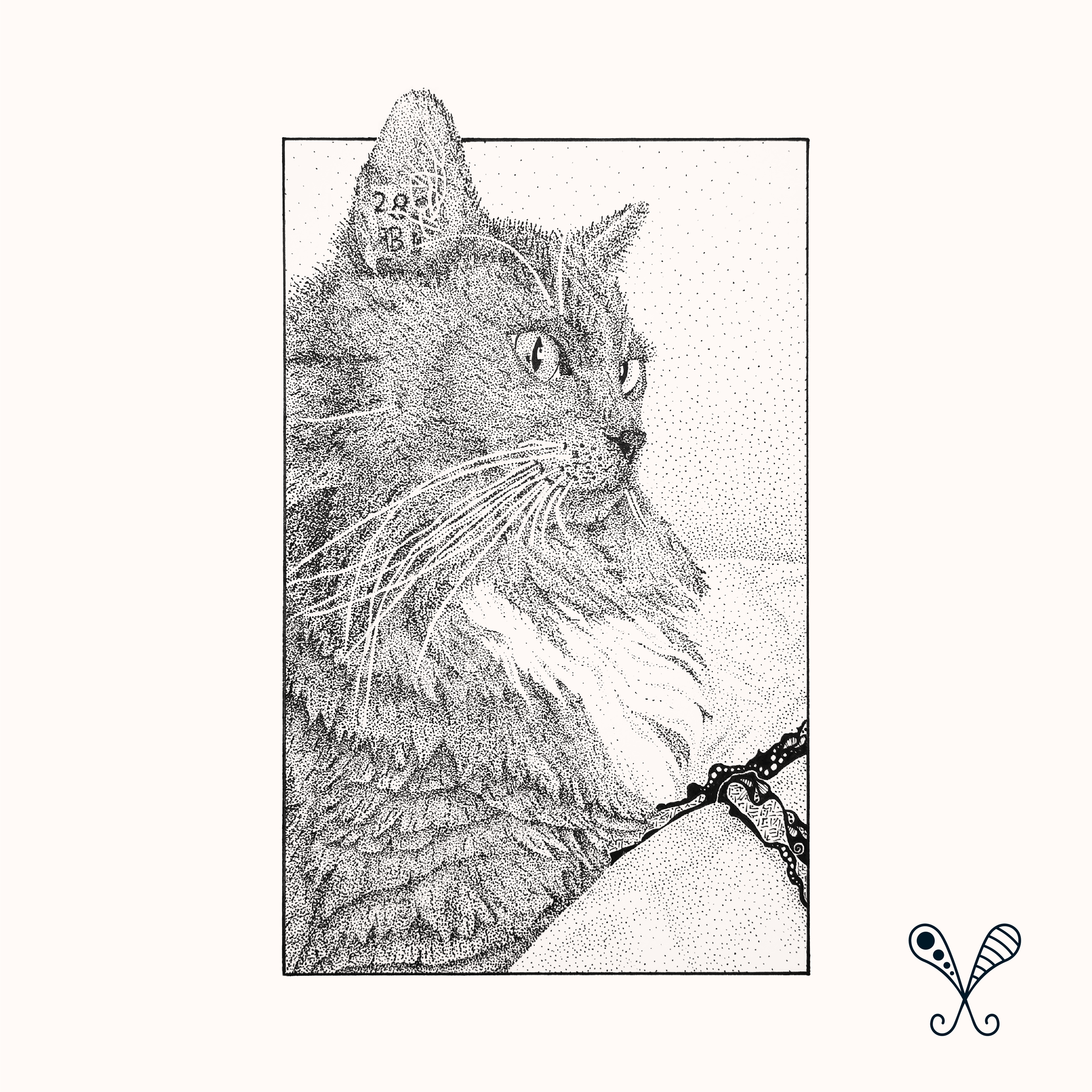
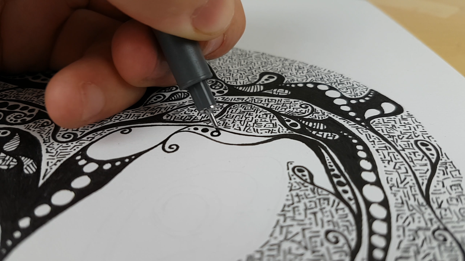
I created The Pattern Project in the UK as a response to the growing issues with mental health in modern society. Having had my own experience with mental health issues I was baffled by the lack of awareness and knowledge that most people and I had about the range and diversity of illnesses that there were effecting the population on a daily basis. The Pattern Nonprofit was created to support local mental health charities through the sale of my illustrations, running mindful colouring sessions with the charity’s clients and education for the public through social media. I ran the company in my spare time alongside my full time job.


Fundraising.
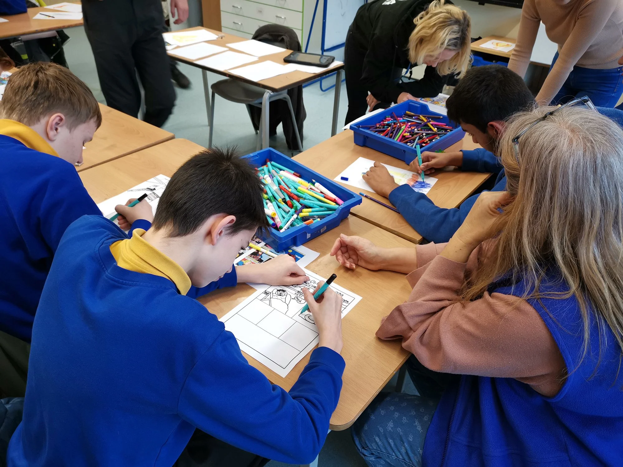
A major part of The Pattern Project was sharing the ability for healing through art as well as the monetary donations generated by the sale of the illustrations. For the duration of The Pattern Project I conducted multiple sessions with the two charities, sharing my personal story and journey with the clients and encouraging them to explore different ways of processing mental health issues. During the year I ran The Pattern Project, I raised over £3000 for the two charities supported charities from the illustration sales.
Branding.
With The Pattern Project being very personal, I wanted to inject as much of myself in to the branding as possible. I created a custom font called “Fraser’s Handwriting” based on my own to be used for the logotype and prominent title text. This playful font is paired with a clean sans serif for body text. I wanted the colours to be soft and warm. All shared illustration images have a peach hue to give them warmth, which is offset by a bold turquoise to draw the eye. The logo icon uses recognizable shapes from my own illustration style, simultaneously displaying symmetry and the random nature of the style.