Branding | Illustration | Graphic
Advance online is a full service marketing and web design agency in the UK. Their work with local businesses in South London helps grow and build them in ways that would not be possible without their knowledge and support. Their previous branding clearly demonstrated their
They required a full rebrand of their company to bring them up to modern standards and helping demonstrate their committed and energetic approach to their projects.

Aesthetic Development
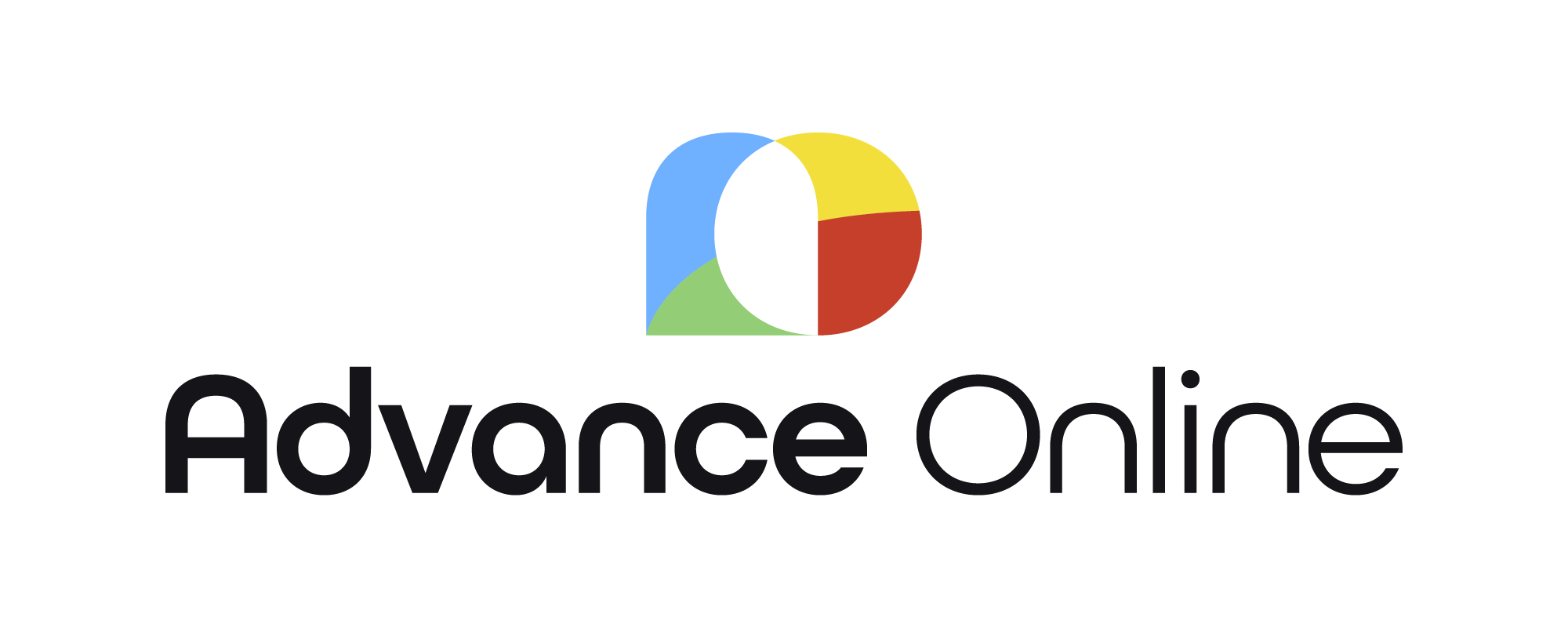
The original logo had a 90’s web development aesthetic and had a mashup of different styles creating a confusing message while misrepresenting the true capabilities of Advance Online’s design and web development team. The new logo uses negative space to demonstrate how business marketing and design is as much about the elements you can’t see as the elements that you can.
Stage 1:
Exploration
Stage 2:
Wordmark pairing & colour.
Stage 3:
Final production & application
Iconography
The iconography is a key visual signifier of the updated brands new colour palette and the creative roots of Advance Online’s business strategy. The liquid shapes behind each icon adds to the more playful nature of the brand messaging and can be mixed and matched with the four bold brand colours to ensure contrast against any background.
Illustration
Each segment of the business needed an associated illustration that visually demonstrates the objective of that product offering. The illustrative style is clean and light to contrast with the bold brand colours while still being readable.


